1. Medium 1/README.md
In 67simran/Rgitsimran: Average annual temperature of India (1901-2020)
RSQlite-simran
GSoC 2022
Test: Plot a time-series line chart on a dataset of your choice with different variables in a single chart. Customize it to make it clear and insightful.
Test
GSoC 2022
ggplot
Author: Simran
Name: RSQLiteAdmin Visualisation Tools
Medium 1
Plot a time-series line chart on a dataset of your choice with different variables in a single chart. Customize it to make it clear and insightful.
 library(ggplot2)
 library(readxl)
 tas_timeseries_annual_cru_1901_2020_IND <- read_excel("C:\\Users\\visha\\Downloads\\tas_timeseries_annual_cru_1901-2020_IND.xls")
 data.frame(tas_timeseries_annual_cru_1901_2020_IND)
 head(tas_timeseries_annual_cru_1901_2020_IND)


 tas_timeseries_annual_cru_1901_2020_IND$Time

 # view the time column
 tas_timeseries_annual_cru_1901_2020_IND$India


 qplot(x = tas_timeseries_annual_cru_1901_2020_IND$Time,
       y = tas_timeseries_annual_cru_1901_2020_IND$India)

 # plotting the data
 ggplot( data = tas_timeseries_annual_cru_1901_2020_IND, aes(x= tas_timeseries_annual_cru_1901_2020_IND$Time, y= tas_timeseries_annual_cru_1901_2020_IND$India  )) +
   geom_line() +
   labs(x = "Year",
        y = "Temperature (C)",
        title = "Annual average temperature",
        subtitle = "India 1901-2020")
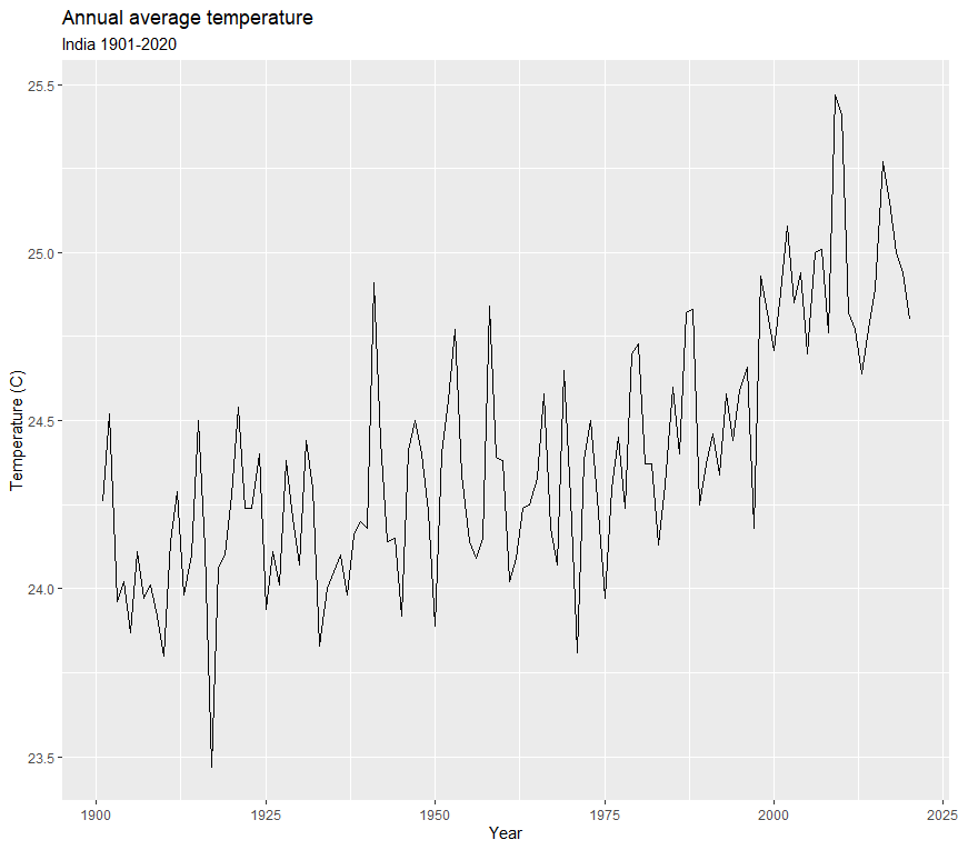
Result
67simran/Rgitsimran documentation built on April 12, 2022, 2:41 a.m.
R Package Documentation
Browse R Packages
We want your feedback!
Note that we can't provide technical support on individual packages. You should contact the package authors for that.
RSQlite-simran
GSoC 2022 Test: Plot a time-series line chart on a dataset of your choice with different variables in a single chart. Customize it to make it clear and insightful.
Test
GSoC 2022
ggplot
Author: Simran
Name: RSQLiteAdmin Visualisation Tools
Medium 1
Plot a time-series line chart on a dataset of your choice with different variables in a single chart. Customize it to make it clear and insightful.
library(ggplot2)
library(readxl)
tas_timeseries_annual_cru_1901_2020_IND <- read_excel("C:\\Users\\visha\\Downloads\\tas_timeseries_annual_cru_1901-2020_IND.xls")
data.frame(tas_timeseries_annual_cru_1901_2020_IND)
head(tas_timeseries_annual_cru_1901_2020_IND)
tas_timeseries_annual_cru_1901_2020_IND$Time
# view the time column
tas_timeseries_annual_cru_1901_2020_IND$India
qplot(x = tas_timeseries_annual_cru_1901_2020_IND$Time,
y = tas_timeseries_annual_cru_1901_2020_IND$India)
# plotting the data
ggplot( data = tas_timeseries_annual_cru_1901_2020_IND, aes(x= tas_timeseries_annual_cru_1901_2020_IND$Time, y= tas_timeseries_annual_cru_1901_2020_IND$India )) +
geom_line() +
labs(x = "Year",
y = "Temperature (C)",
title = "Annual average temperature",
subtitle = "India 1901-2020")
Result
R Package Documentation
Browse R Packages
We want your feedback!
Note that we can't provide technical support on individual packages. You should contact the package authors for that.
Embedding an R snippet on your website
Add the following code to your website.
For more information on customizing the embed code, read Embedding Snippets.